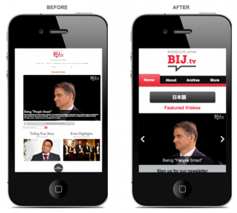
The explosion, over the past few years, in the variety of devices that can connect to the internet shows no signs of subsiding.
Analysts have calculated that 100mn tablet computers were sold worldwide in 2011, while smartphones and tablets are being produced by an ever-increasing number of manufacturers. No format or size has yet to emerge as a definitive winner.
Research by Google shows that smartphone penetration is on the rise in Japan; 20% of Japanese now own such a device. And it’s not just the younger digital natives who are driving this change.
Those in their 30s and 40s make up almost a third of all smartphone users, while 77% use their phone everyday to go online.
Compared with a desktop or laptop computer, the increased convenience and portability means that the tablet or smartphone is being seen as the most important way to access the internet. Increasingly, tablets are overtaking TV for entertainment and video consumption.
So what does this mean for businesses looking to inform and gain new customers through their websites?
A traditional website that has been optimised for a desktop computer doesn’t satisfy the consumer on-the-move who has a different set of needs.
Such an individual is more likely to be looking for a link to a mobile map or a phone number for an office, or to want quick access to key information.
You may think: “my phone can browse any website”. True, but this does not mean that your website is mobile-optimised.
A mobile-friendly website is specifically designed for small screens, and takes into account navigation patterns and how to provide convenience to mobile users.
However, a bad mobile experience will drive your potential customer to your competitors’ site.
At the same time, users expect their mobile experience to be as good as their desktop experience. But with multiple screen sizes and operating systems in place, how can a business ensure that their mobile site looks good on every device?
One method is to use responsive web design, so that your site will look its best on mobiles, tablets and desktops of all sizes.
Ensuring that your site is not reliant on the Adobe Flash Platform is now a key requirement to confirm you are not missing out on customers who use Apple products.
While the latest version of HTML5, the markup language for structuring and presenting content for the internet, offers many of the same interactive features already in common use on the web, it also provides for animation and allows for quicker loading times.
Mobile site best practices from Google’s GoMo Campaign include:
• Keep it quick—mobile users are often short on time, and squeeze in online tasks as they go about their day. To help them, design your site to load quickly and make copy easy to read.
• Make it easy to convert—no matter what your site’s objective, your customers need to be able to convert it using a virtual keyboard and no mouse. Make it easy to buy something or contact you.
• Simplify navigation—no one likes to be confused. Clear navigation and search functionality, on large or complex sites, will help your customers easily find what they need.
• Make it local—consumers look for local information on their phones all the time. Include functionality that helps people find and get to you.
• Be thumb-friendly—people use their fingers to operate mobile devices, especially their thumbs. Design your site so even large hands can easily interact with it.
• Make it seamless—people often use multiple screens throughout the day. As much as possible, convert as much of the functionality of your desktop site to mobile, to create a seamless experience.
• Design for visibility—a mobile-friendly site gets its message across without causing eyestrain. Make it easy for your customers to read. Remember they may be in a place with limited light.
• Use mobile site redirects—a mobile site redirect is code that can automatically tell if visitors are using a mobile device and send them to the mobile-friendly version of your site. Have your site developer implement this redirect code so that your customers can get the best version of your site for their needs.
• Make it accessible—your mobile site should work across all mobile devices and all handset orientations.
• Listen, learn and iterate—good mobile sites are user-centric, meaning they’re built with input from your audience. Ask your desktop site users what they want in a mobile website and make testing and optimisation an ongoing process.
The latest trend in marketing is SoLoMo, integrated social, local and mobile campaigns that empower firms to reach specific customers at the right time and place with the right offer.
Major brands such as L’Oréal are using mobile devices to combine geo-location data with social media, often to push out deals or search results related to products and services in one’s immediate vicinity.
The brand also created a social platform that was designed to provide local salons that joined the programme with marketing resources, including marketing materials and advice on how to increase local engagement with consumers. The result? Salons reported an uptick in customer footfall and sales.
Meanwhile, Google’s research shows that mobile commerce, or m-commerce, still has some way to go in Japan. Only 39% of respondents have made a purchase using a smartphone, while 67% say they prefer to use a computer for online purchases. Some 24% believe it is not secure to do so.
To test how your website appears on a smartphone, visit: www.howtogomo.com/en/d/test-your-site/#gomo-meter
Need a mobile-optimised website? Let us help!
With our responsive designs and robust development, Custom Media’s mobile website development team ensures your site is engaging and, in turn, improves your sales conversion rate.
In addition, our detailed mobile site traffic analysis report helps you better understand your customers’ interaction with your site— improving your bottom line!
For a preview, please visit: http://preview.custom-media.com/compare/businessinjapan


