- Advert design wins four top awards
- Took 10 staff three months to finish
- Inspired by death of director’s father
- Designer eyes colourful funerals
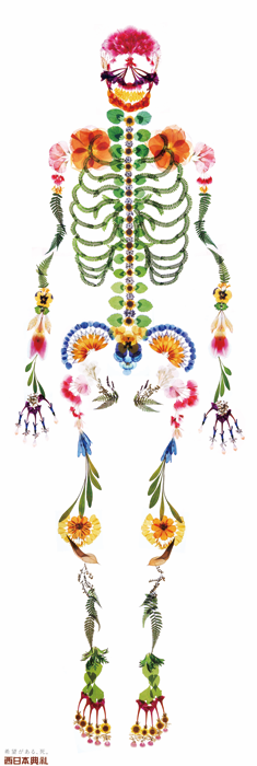
The Tokyo-based advertising agency I&S BBDO Inc. recently won a number of prestigious creative awards, including silver at the Clio Awards—major international creative honours—for their advert design for Japanese funeral home Nishinihon Tenrei.
Funerals in Japan, as in most other countries, are sombre events represented in black and white. The Life is Endless campaign was created to open up new possibilities by bucking the trend of muted colours that are prevalent in the funeral industry.
BCCJ ACUMEN spoke to Mari Nishimura, creative director of I&S BBDO Tokyo.
Congratulations on winning a Silver Clio Award, for your stunning poster. Please tell us how you came up with the design concept.
I lost my father a while ago. His funeral was held at Nishinihon Tenrei funeral parlour, which asked us to create the ad. Since then, I have had profound feelings about funerals.
A funeral is an occasion when one can show one’s gratitude to those whom one is leaving behind, so I believe it could be colourful and festive. A funeral is also for the family of the deceased, and it gives them an opportunity to watch over their loved one who is departing on a journey.
This is how I see funerals now, and it is the idea on which my concept is based.
How many members of your team worked on the project and for how long? What did each member do?
About 10 members were involved, including those who worked on the short film that shows the making of the poster.
I led the project together with our art director, while our executive creative director played an important role in giving directions.
It took about three months to finish the project.
The Clio is the most recent award that this project has won. Tell us about the other three awards.
We won silver at the 2012 Epica Awards (originally focused only on Europe, but opened to worldwide competition in 2012); a Merit at the 2013 One Show Design Awards (one of the most prestigious worldwide competitions celebrating the year’s best in design); and an in-book award at the 2012 Design and Art Direction Awards (regarded as one of the most difficult awards in the world to win).
What were the most challenging aspects of creating this design?
Since we used a coffin as the motif, we wanted to make our poster the size of an actual person.
Thus, achieving the optimum printing technique posed the greatest challenge. We had to keep adding colours over and over again to ensure it was printed to perfection.
Do you think, or hope, that this colourful style—rather than traditional sombre, dark shades—will signal a change in how the funeral industry markets itself?
I very much hope so. I want my own funeral to be a colourful and festive occasion.
Since religion needs to be considered, I cannot speak for everyone. But I believe it is very important to have some freedom when it comes to funerals.
Has anyone expressed negative comments about this taboo subject, or accused you of being disrespectful to the dead?
No, I haven’t heard any negative opinions so far.
Did the client take a great deal of convincing that this design was the way to go, or did they accept it readily?
While some degree of persuasion was needed, the client basically accepted our design.
They understood that I had created the design as a requiem to my father and out of gratitude to the funeral parlour for helping us conduct a beautiful funeral service for him.
How do you, your team and your firm feel about winning this award?
I hope this beautifully designed poster will help to change perceptions about, and the concept of, funerals.
I believe that when you start questioning things that you’ve been taking for granted, a door to a new world opens. My whole team also believe this.
